Tuesday, 3 November 2015

My Double Page Article

My Double Page Article


Double Page Spread
 
 
Instead of using Photoshop I decided to use Adobe InDesign as it was easier to add columns of text. I decided that half of my page would be an image of the band and the remaining half would feature the article. I followed the size of the little white lie pages and created a 400mm by 245mm double page spread with 6 different articles despite the fact I was only using three I needed 6 to be on the page so they were less spaced out.

I added a scale to the top of my page so I could see where directly half way was on the page. From 200-400  placed the page on the right hand side of the double page spread. The image I have chosen for the second half of the double page spread is featured in a graveyard, I decided on this mise-en-scene as it corresponds in with the name of the band. The other images I had taken were too far away, I thought that this image focused more on the two artists. The grey scale creates an eerie feel to the image. The problem I faced when adding the image into the double page spread was that the image was pixelated.

After my research I had seen that on most double page spread in notion had a logo on so I decided to use a black circle with white writing saying 'OPUS exclusive'. I then added a little extra to the page so that the audience would recognise the people who also helped the page be deigned ( these names are made up). I added the name of the band to the centre of the top of the page and the name of the article a quarter of the way down the page. I used a black rectangle to separate the article and the extra information at the top of the page.  I have used the same fonts throughout the magazine. I used a short tag line which is also a typical convention of a magazine.


I then copied my article from word and pasted it into the columns. I put some of the main information in italics and following the conventions of a typical magazine made the first letter of the magazine article larger than the rest. I used times new roman and size 11 font to ensure the hole article fitted onto the page. This simple design follows the

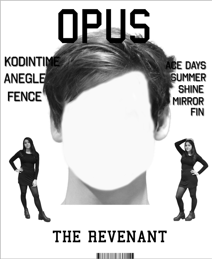
On the image at the top of the age the image is pixelated. I have found a solution for this by selecting and image, selecting view and making sure that the display performance is High definition, this prevents the image from being pixelated as it displays the image exactly from Photoshop where I imported it from. I have also added the page number which is inline with the text, the font follows the font I have used on the front cover and on the opus exclusive. I have also increased the size of the word Opus as it's more effective and makes the name of the magazine stand out, adding a exclamation mark emphasises how exclusive this article is.

As a final touch I added an indent into my paragraphs.


Friday, 23 October 2015

Final Front Cover Post


Finally I have placed the grid onto the page to ensure that the text is in lined with one another as my page is symmetrical I have tried to in line each set of text with one another.
 

I have added more blending options to the text to that it is more visible as it seems hard to see Kodintime as it was a similar colour to the artist’s hair. I have added an outer glow with the colour of the artist’s neck, grey. I have also moved up my barcode as usually when magazines are made they slice off the bottom of the page slightly and I have added the issue number and date to either size of the barcode.

Front Cover Edits


I took two images of my female model dressed in provocative black clothing as this is usually how women are dressed on magazines. I decided on the black theme as it went with the black and white theme. I placed these two images onto the page. The effect I was looking for was that my female model was positioned smaller than the main image of the male in the band. I positioned her to the left and right of the where the main image was going to be placed.

To get the image the way it is, I had to edit the image on Photoshop. I used the magic wand tool to delete the background of the image; this left me with a transparent background and the image. Due to the fact I used the green room to take the images they had a hint of green almost everywhere. In order to get the image back to its normal colour I used the colour replacement too add the skin colour and outfit back to the normal image. I then added a greyscale feature to follow the theme of the magazine.


The main image was by far the hardest part of the making of my magazine. I wanted something unique to be added to my magazine so I decided I didn't want the face of the male artist on the front cover. In order to delete this I chose an area of the face with a colour I liked and I brushed the colour over the top of the face. I ensured that when I was doing this I kept the shape of his face. I decided this simple design was to be my front cover.


I have decided since then that my design is too simple and needed a little more added to it. From doing more research into notion front covers I have notice that most of the time the front covers feature the names of other bands and artists that are included inside the magazine. So from this I have decided to create some bands and artists and place them on my front cover. I brought the text in front of the image so that you could see the text. I added a shadow so that the text was more visible.
I have added more blending options to the text to that it is more visible as it seems hard to see Kodintime as it was a similar colour to the artist’s hair. I have added an outer glow with the colour of the artist’s neck, grey. I have also moved up my barcode as usually when magazines are made they slice off the bottom of the page slightly and I have added the issue number and date to either size of the barcode.


My Front Cover

Front Cover
 
For being such a simple design this piece had been the hardest to develop. I wanted my front cover to follow notions simplistic theme as well as adding a unique twist.
 

The barcode


The first step in the making of my magazine was to decide where to place the barcode. I used an image from the internet and cropped it so it was not as large. I placed it in the centre at the bottom of the page so it did not look like it had just been placed anywhere on the magazine. I prefer when magazine have them hidden away a bit instead of in the corner where they look like big blocks.


The Masthead


I was pretty much still with a blank page so the next step was to decide where what I was going to do about making the title of the magazine. Since I had already began to use to 'Octin College' font I decided it would be bet to follow this theme and create my magazine name with this. I have decided to call my magazine 'OPUS' as I liked the fact it meant any artistic work on a large scale. I placed the title of my magazine in this particular position as magazine titles are usually placed here. The large black letter stand out to my target audience.


The band title


The next step was to make the title of my band and place it on the front cover. I used the same font as I had previously yet I made the text smaller and less noticeable so it did not take away he attention of the title of the magazine. I placed near the bottom of the page so that it would be positioned underneath the central image of my front cover.


More Double Page Edits


The page looked plain and I didn't feel as though it wouldn't catch enough readers attention so I decided to change it around slightly. I decided against a concert image and decided to add a block colour to the background so I asked a few of my class mates and they decided that the image would look better if it as larger in the centre of the page and adding colour would catch their attention more. Keeping this in mind I increased the size of the image and added a grey background behind the image. I placed the names of the artists next to their heads so that the readers would understand who they are easily.


I have had to justify my reasoning as to why I have decided on a double page spread. I have added a thicker boarder and is now similar to the little white lies design. 75% of the people I asked said the page was more effective with the boarder on the page.
 
After looking at various little white lies magazine I have noticed that there are no page numbers of the right hand side of the age if there is a number placed on it. Therefore I have deleted the page number from the corner of the page.
 

Double Page Edits


I placed the final smoothed black and white image onto my double paged spread.
I used the college front I have used throughout the magazine to create the word introducing onto the top centre part of my double page spread. I used the line tool to create a shape around this.
 

I have added the two artists names with a font I think contrasts well with the page design. I am thinking about adding an image of a concert stage onto the background of the page to create a better effect and make my design more unique however because I have to use my own taken images I will have to insert this at a later date.


Double Page Spread Edits


I have decided to use this image as it is a medium close up of the band as well as the fact that 75% of the people I asked chose this image out of the 3 I questioned. I did not like the background of the image as it did not represent a band on stage. I decide that the best thing to do was to make a transparent background for the image so that I could insert my own image into the background.


I used the quick selection tool to delete the background from the image. I selected the outline of the band carefully so that I did not delete any of the features of the image I wanted.
 
Deleting this selected area left me with a transparent background meaning I could copy the image onto my double page spread. Once I had smoothed the edges of the image.