 I took two images of my female model dressed in
provocative black clothing as this is usually how women are dressed on
magazines. I decided on the black theme as it went with the black and
white theme. I placed these two images onto the page. The effect I was looking
for was that my female model was positioned smaller than the main image of the
male in the band. I positioned her to the left and right of the where the main
image was going to be placed.
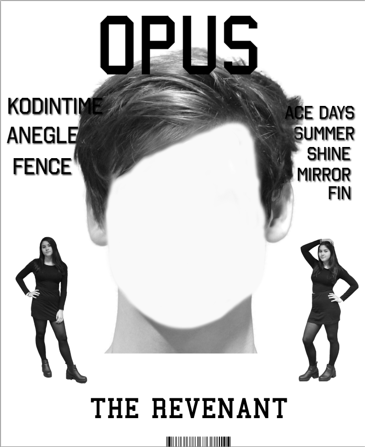
I took two images of my female model dressed in
provocative black clothing as this is usually how women are dressed on
magazines. I decided on the black theme as it went with the black and
white theme. I placed these two images onto the page. The effect I was looking
for was that my female model was positioned smaller than the main image of the
male in the band. I positioned her to the left and right of the where the main
image was going to be placed. To get the image the way it is, I had to edit the image on Photoshop. I used the magic wand tool to delete the background of the image; this left me with a transparent background and the image. Due to the fact I used the green room to take the images they had a hint of green almost everywhere. In order to get the image back to its normal colour I used the colour replacement too add the skin colour and outfit back to the normal image. I then added a greyscale feature to follow the theme of the magazine.

The main image was by far the hardest part of the making of my magazine. I wanted something unique to be added to my magazine so I decided I didn't want the face of the male artist on the front cover. In order to delete this I chose an area of the face with a colour I liked and I brushed the colour over the top of the face. I ensured that when I was doing this I kept the shape of his face. I decided this simple design was to be my front cover.
 I have decided since then that my design is too simple and needed a
little more added to it. From doing more research into notion front covers I
have notice that most of the time the front covers feature the names of other
bands and artists that are included inside the magazine. So from this I have
decided to create some bands and artists and place them on my front cover. I
brought the text in front of the image so that you could see the text. I added
a shadow so that the text was more visible.
I have decided since then that my design is too simple and needed a
little more added to it. From doing more research into notion front covers I
have notice that most of the time the front covers feature the names of other
bands and artists that are included inside the magazine. So from this I have
decided to create some bands and artists and place them on my front cover. I
brought the text in front of the image so that you could see the text. I added
a shadow so that the text was more visible.
I have added more blending options to the text to that it is
more visible as it seems hard to see Kodintime as it was a similar colour to
the artist’s hair. I have added an outer glow with the colour of the artist’s
neck, grey. I have also moved up my barcode as usually when magazines are made
they slice off the bottom of the page slightly and I have added the issue
number and date to either size of the barcode.
No comments:
Post a Comment