My Double Page Article
 |
| Double Page Spread |
Instead of using Photoshop I decided to use Adobe InDesign as it was easier to add columns of text. I decided that half of my page would be an image of the band and the remaining half would feature the article. I followed the size of the little white lie pages and created a 400mm by 245mm double page spread with 6 different articles despite the fact I was only using three I needed 6 to be on the page so they were less spaced out.

I added a scale to the top of my page so
I could see where directly half way was on the page. From 200-400 placed
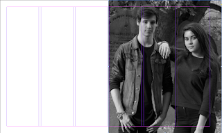
the page on the right hand side of the double page spread. The image I have
chosen for the second half of the double page spread is featured in a
graveyard, I decided on this mise-en-scene as it corresponds in with the name
of the band. The other images I had taken were too far away, I thought that this image focused more on the two artists. The grey scale creates an eerie feel to the image. The problem I
faced when adding the image into the double page spread was that the image was
pixelated.
After my research I had seen that on most
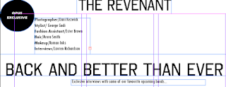
double page spread in notion had a logo on so I decided to use a black circle
with white writing saying 'OPUS exclusive'. I then added a little extra to the
page so that the audience would recognise the people who also helped the page
be deigned ( these names are made up). I added the name of the band to the
centre of the top of the page and the name of the article a quarter of the way
down the page. I used a black rectangle to separate the article and the extra
information at the top of the page. I have used the same fonts throughout the magazine. I used a short tag line which is also a typical convention of a magazine.

I then copied my article from word and pasted
it into the columns. I put some of the main information in italics and following
the conventions of a typical magazine made the first letter of the magazine
article larger than the rest. I used times new roman and size 11 font to ensure the hole article fitted onto the page. This simple design follows the
On the image at the top of the age the image is pixelated. I have found a solution for this by selecting and image, selecting view and making sure that the display performance is High definition, this prevents the image from being pixelated as it displays the image exactly from Photoshop where I imported it from. I have also added the page number which is inline with the text, the font follows the font I have used on the front cover and on the opus exclusive. I have also increased the size of the word Opus as it's more effective and makes the name of the magazine stand out, adding a exclamation mark emphasises how exclusive this article is.
 |
As a final touch I added an indent into my paragraphs. |


